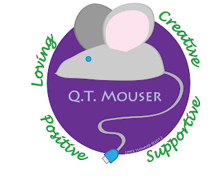
This week, we spent time delving into ourselves to create a personal brand. In talking with several people at work and home, I was able to create a list of words that described myself. It was hard to narrow down the list of words; however, I grouped related terms together and choose one word from each group that represented each. I ended up with: creative, supportive, positive and loving. From there, I thought about how the image would convey more information about me. For the past 28 years, my husband has called me "cutie mouser." This is the basis for my online handle, "qtmouser." To incorporate this image with my interest in technology, the mouse is drawn in a shape that is similar to a computer mouse with the tail ending in a USB connector. The final step was to work with the colors. Following the recommendation of Lea Alcantara, from her article The Art of Self-Branding, Part 1 & 2 (2009), I looked at my wardrobe and realized my colors were jewel tones: blue, green purple, and red. The meanings of these particular colors also describe my personality. From her article A Glimpse into the Meaning, Symbolism and Psychology of Color, Kate Smith, In researching these colors, I found the meanings, symbolism and psychology described my personality, attitudes and beliefs. Blue is considered to indicate trustworthiness and dependability, which are the basis of my work ethic. Nature is a big part of what makes me feel grounded and at peace with the world, which is represented by the green on my logo. My creative and spiritual side is shown through the use of purple as the background of my logo. Though mice can be brown and grey, I chose grey. From Ms. Smith’s (2009) site, I found that grey is perceived as timeless, practical and conservative. The final color in my palette is pink. Since it is the lighter tint, it reflects my joy and happiness with life. The one color that I was not able to include was red. The one color that I was not able to incorporate was red. When red is pair with green, people think of Christmas, the day I was born.
Alcantara, L. (2009). The art of self-branding. http://www.lealea.net/blog/comments/the-art-of-self-branding-part-one/
Alcantara, L. (2009). The art of self-branding. Retrieved from http://www.lealea.net/blog/comments/the-art-of-self-branding-part-two/
Smith, K. (2012). A glimpse into the meaning, symbolism and psychology of color. Sensational COLOR. Retrieved January 27, 2012, from http://www.sensationalcolor.com/color-messages-meanings/color-meaning-symbolism-psychology/psychology-of-color-a-glimpse-into-the-meaning-symbolism-psychology-of-color.html
