Sunday, March 18, 2012
EDLD 5398 - Week 3 Web Conference - March 18, 2012
Once we got past the problems with sound and video, we had a great discussion regarding the various requirements for both the ETL and Principal Certification. Several of the group have been in the new list of course work which allows us to take the principal exam should we choose. Due the changes in the course work, we will need to submit reflections from the principal courses in place of the ETL ones we did not take. The principal requirements were also discussed. Though we can place these documents on our wiki site, it is not necessary; however, we do need to email them to the Certification Office and upload them into the TK20 binder that has been assigned. There were two other questions regarding the our paths for life long learning. The first question referred to getting published and the second, what professional technology organizations to join. The answer to both questions were the same: www.tcea.org and www.iste.org. These organizations focus on technology in education and are always looking for good articles regarding the use of technology in the classroom.
Saturday, February 18, 2012
EDLD 5366 - Course Reflection
The web site creation was a great experience. It not only required us to apply the design principles but also the technology in education knowledge we have acquired over the past 18 months. The design principles of contrast, repetition, alignment, and proximity (C.R.A.P.) were a new way of looking at how graphics make an impact on my learning. By analyzing graphical information, I learned it was conveying more information than just a pleasing composition similar to the way an author uses word to impart a deeper meaning to a story (Hernandez, 2009). I now look at advertisements, billboards, and other graphics in a different light; looking for the underlying message.
The name of our website, Revolutionizing Your School, set the tone and direction of the website. A brand was needed to convey this idea and what was going to be shared on the site (Alcantara, n. d.). Using C.R.A.P. we created the logo indicating the move from the traditional school to one that is futuristic. The logo colors determined our color palette for the website. One item that seemed to be consistent in the design was the use of videos and digital graphics to support or reinforce the information being delivered. As we completed our chosen page, the others in the group would review and make suggestions for improvement. I found this to be a beneficial method to learn how to apply the concepts. It permitted other voices to be heard and resulted in a site that demonstrates unity and organization.
I have created a professional website that is used to share technology applications and research with the faculty on my campus. I have received good response to the content being presented; however, with the understanding of the design principles, I need to take time to revamp some aspects of the website to create a more consistent design. I wonder what would happen if I were to redesign how I present information in training through the use of C.R.A.P. and more digital imagery? Will the participants be more engaged and retain more of the knowledge?
To view our site: Revolutionizing Your School
Websites in the PK-12 Classroom
Throughout our coursework for Educational Technology Leadership, we have analyzed the use of technology in the classroom. One of the most flexible technologies is a good website. Websites in the PK-12 classroom can be used in multiples ways. Teachers use their websites to communication with parents and students about their classroom, assignments, projects and other information. For instructional purposes, students are able to use websites to delve deeper into concepts being taught. For elementary schools, interactive websites help support learning of basic skills. As students mature, they can create websites with information to present their knowledge or to help teach others. Collaboration is another way sites can be used in the classroom. Being able to share thoughts and ideas with others that either agree or disagree help students learn how to express themselves. These are just a few of the ways I have and can use websites in PK-12 classrooms.
Alcantara, L. (n.d.) The art of self-branding: Part 1. Lealea Design. Retrieved February 6, 2012 from http://www.lealea.net/blog/comments/the-art-of-self-branding-part-one/
Hernandez, M. (2009). Basic Design Principles. Retrieved on February 3, 2012 from http://www.scribd.com/doc/23940707/Contrast-Repetition-Alignment-Proximity
Johnson, B. (2012, January 26). College readiness: Learning collaboratively. Edutopia. Retrieved on February 17, 2012 from http://www.edutopia.org/blog/college-readiness-collaborative-learning-ben-johnson
Wednesday, January 25, 2012
EDLD 5366 - Personal Logo - Week 2
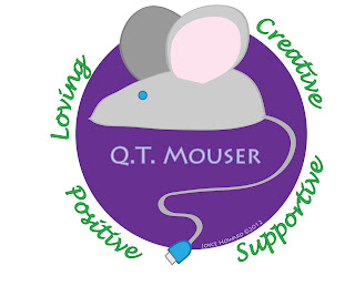
This week, we spent time delving into ourselves to create a personal brand. In talking with several people at work and home, I was able to create a list of words that described myself. It was hard to narrow down the list of words; however, I grouped related terms together and choose one word from each group that represented each. I ended up with: creative, supportive, positive and loving. From there, I thought about how the image would convey more information about me. For the past 28 years, my husband has called me "cutie mouser." This is the basis for my online handle, "qtmouser." To incorporate this image with my interest in technology, the mouse is drawn in a shape that is similar to a computer mouse with the tail ending in a USB connector. The final step was to work with the colors. Following the recommendation of Lea Alcantara, from her article The Art of Self-Branding, Part 1 & 2 (2009), I looked at my wardrobe and realized my colors were jewel tones: blue, green purple, and red. The meanings of these particular colors also describe my personality. From her article A Glimpse into the Meaning, Symbolism and Psychology of Color, Kate Smith, In researching these colors, I found the meanings, symbolism and psychology described my personality, attitudes and beliefs. Blue is considered to indicate trustworthiness and dependability, which are the basis of my work ethic. Nature is a big part of what makes me feel grounded and at peace with the world, which is represented by the green on my logo. My creative and spiritual side is shown through the use of purple as the background of my logo. Though mice can be brown and grey, I chose grey. From Ms. Smith’s (2009) site, I found that grey is perceived as timeless, practical and conservative. The final color in my palette is pink. Since it is the lighter tint, it reflects my joy and happiness with life. The one color that I was not able to include was red. The one color that I was not able to incorporate was red. When red is pair with green, people think of Christmas, the day I was born.
Alcantara, L. (2009). The art of self-branding. http://www.lealea.net/blog/comments/the-art-of-self-branding-part-one/
Alcantara, L. (2009). The art of self-branding. Retrieved from http://www.lealea.net/blog/comments/the-art-of-self-branding-part-two/
Smith, K. (2012). A glimpse into the meaning, symbolism and psychology of color. Sensational COLOR. Retrieved January 27, 2012, from http://www.sensationalcolor.com/color-messages-meanings/color-meaning-symbolism-psychology/psychology-of-color-a-glimpse-into-the-meaning-symbolism-psychology-of-color.html
Friday, January 20, 2012
EDLD 5366 - Business Card - Week 1
The design of the business card reflects my personality, using bright colors and a clean font. The mouse graphic from Microsoft's online gallery determined the color scheme. To use as a teaching tool, the first design element, contrast, is found in the different font sizes and the colors being used. The pink color of the font and mouse wheel demonstrates the second element, repetition. Alignment of the text and graphic on the left and the text on the right establishes the third element. The final design element, proximity, is found in the grouping of my name and title and the contact information.


Thursday, January 19, 2012
EDLD 5366 - Manuscript Reflection - Week 1
Manuscript -- Henry VIII's Psalter
Location -- http://ttpdownload.bl.uk/app_files/silverlight/default.html?id=3FF14446-29B5-4198-B32A-FB42C43A4B71
This manuscript, created for King Henry VIII, was beautifully illustrated. All four principles of design are represented in this particular sample. Contrast can be found in the use of color in the illustrations. Light colors offset by darker colors bring the viewers attention to specific parts of the pictures. Another example of this design element is the use of colorful, decorative capital letters at the beginning of each psalm verse contrasts with the smaller, black characters of the remainder. These are repeated throughout the manuscript. Repetition is found in the use of rotating ornamental graphics placed at the end of the verses. These are used to fill in the empty space at the end of the verse to insure the lines all end on the right-hand margin. Examples of the final element, proximity, are the illustrations that are placed beside specific verses to bring attention to the message. This manuscript was bound in red velvet with silver-guilt corner pieces and clasp demonstrating the importance of this document.
Tuesday, December 13, 2011
EDLD 5363 - Week 5 Reflection -- PSA Video
Our group began the project by creating a Google website where collaborations and final products would be posted. Once an outline of the pre-production information was posted, all members of the team chose their favorite color and began filling in information on the chart. We communicated our individual progress with each other by a running email conversation. When decisions were made, the information for the pre-production was moved to our final assignment. Throughout the production and post-production phase, we posted both our assigned shots and commented on which we will need to pull from the Internet. The first edit was rough and did not quite turn out as it was originally envisioned. The second edit was much better. It balanced the message with the images.
In reviewing our video, my one improvement would be to include a varied ethnic mix for both those who dropped out and those who were successful. With the short time limit, we looked for pictures that would illustrate our point without considering the ethnic mix. We made an effort to choose photos with Creative Commons Licenses.
As a group, we worked well together. Our personal strengths complemented each other and allowed us to perform each of the tasks required.
Here is our final video. Enjoy!
Here is our final video. Enjoy!
EDLD 5363 - Week 4 - Web Conference - December 10, 2011
Attended the Saturday morning web conference. Looked like all of us had a rough week when you look at the video. Dr. Abernathy introduced us to Pamela, who is managing the TK20 site. Pamela was available for questions about the site. Dr. Abernathy reviewed what needed to be uploaded on the TK20 site for this class: Revised Pre-Production document handed in Week 3, the final PSA Video, and the site/document showing the collaborations that took place during Weeks 3-5. She also mentioned these are the items that need to be submitted by the end of Week 5 on December 16, 2011. Many of the students were sharing information about the resources they were using to complete the PSA video. There was some discussion about the Lamar assigned mentor that several of the students had. If you still need a mentor (depending on when you entered the program) you needed to contact Mr. Benivedez. The rest of the conversation was answering miscellaneous questions regarding the PSA video.
Subscribe to:
Posts (Atom)